Introduction: The Hidden Language of Colors
Have you ever wondered why Facebook is blue, Coca-Cola is red, or Whole Foods is green? These color choices aren't random—they're strategic decisions based on the psychology of color and how it influences consumer perception.
In today's competitive market, understanding color psychology isn't just helpful—it's essential for creating a memorable brand identity that resonates with your target audience.
Color is often the first element consumers notice about your brand, and it can impact everything from recognition to purchasing decisions. Research shows that color increases brand recognition by up to 80%, and 85% of consumers cite color as the primary reason they purchase a product.
In this comprehensive guide, we'll explore how different colors impact consumer psychology and how you can leverage this knowledge to strengthen your brand identity.
The Science Behind Color Psychology
Color psychology is the study of how colors affect human behavior, emotions, and perceptions. Our response to color is both biological and cultural—some reactions are hardwired into our brains, while others are learned through cultural associations.
When we see color, our brain processes it in the visual cortex, triggering reactions that influence our mood, appetite, and even heart rate. This neurological response happens within seconds, often before we consciously process the brand or message.
The Emotional Color Wheel
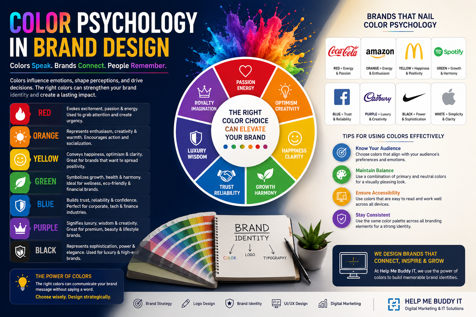
- Red: Excitement, passion, urgency
- Blue: Trust, reliability, tranquility
- Green: Growth, health, peace
- Yellow: Optimism, clarity, warmth
- Purple: Luxury, creativity, wisdom
- Orange: Enthusiasm, friendliness, energy
- Black: Sophistication, authority, elegance
- White: Simplicity, cleanliness, purity
Primary Brand Colors and Their Psychological Impact
Red: The Bold Attention-Grabber
Red is psychologically stimulating, increasing heart rate and creating urgency. It's associated with passion, excitement, and energy, which is why brands like Coca-Cola, YouTube, and Netflix use it to grab attention and stimulate appetite.
Industries that benefit: Food and beverage, entertainment, clearance sales, emergency services.
Example: McDonald's combines red with yellow to stimulate hunger and create feelings of happiness.
Blue: The Trustworthy Professional
Blue is the world's favorite color and conveys trust, dependability, and professionalism. It has a calming effect and is associated with water, sky, and stability.
Industries that benefit: Finance, technology, healthcare, legal services.
Example: Facebook, Twitter, LinkedIn, and PayPal all use blue to establish trust and reliability.
Green: The Natural Growth Symbol
Green represents growth, health, and environmental consciousness. It's calming and associated with nature, prosperity, and renewal.
Industries that benefit: Environmental brands, organic products, financial services, education.
Example: Whole Foods Market and Starbucks use green to reinforce natural and sustainable brand values.
Yellow: The Optimistic Attention-Getter
Yellow captures attention with its brightness and conveys optimism, clarity, and warmth. It stimulates mental activity and generates energy.
Industries that benefit: Food, children's products, affordable brands, leisure.
Example: IKEA combines yellow and blue to balance affordability and reliability.
Purple: The Creative Luxury Signal
Purple historically symbolizes royalty and luxury. Today, it conveys creativity, wisdom, and quality.
Industries that benefit: Beauty, luxury goods, anti-aging products, spiritual services.
Example: Cadbury uses purple to communicate indulgence and premium quality.
Orange: The Energetic Motivator
Orange blends the energy of red with the cheerfulness of yellow, creating feelings of enthusiasm, creativity, and determination.
Industries that benefit: Fitness, entertainment, food, children's products.
Example: Nickelodeon and Home Depot use orange to communicate energy and enthusiasm.
Black: The Sophisticated Authority
Black communicates sophistication, authority, and exclusivity. It is powerful, elegant, and timeless.
Industries that benefit: Luxury goods, fashion, electronics, premium services.
Example: Chanel uses black to represent elegance and timeless style.
White: The Clean Minimalist
White represents simplicity, cleanliness, and purity. It creates a sense of openness and possibility.
Industries that benefit: Healthcare, technology, wedding services, minimalist brands.
Example: Apple uses white to highlight clean design and simplicity.
Color Combinations and Brand Personality
Complementary Colors
- Red & Green – Great for seasonal promotions.
- Blue & Orange – Balances professionalism with friendliness.
- Purple & Yellow – Combines luxury with optimism.
Analogous Colors
- Blue & Green – Nature-inspired trust.
- Red & Orange – Energetic and exciting.
- Yellow & Green – Fresh and accessible.
Monochromatic Schemes
Using different shades of the same color creates sophisticated and cohesive brand identities.
How to Choose the Right Colors for Your Brand
1. Define Your Brand Personality
- Serious and trustworthy? Use blues and navy.
- Creative and innovative? Explore purples and bright accents.
- Eco-friendly? Use greens and earth tones.
- Affordable and cheerful? Consider yellow and orange.
2. Research Your Industry
Understand color norms in your market and decide whether to follow or challenge conventions.
3. Study Your Competition
Identify oversaturated colors and opportunities for differentiation.
4. Consider Cultural Differences
- White symbolizes purity in Western cultures but mourning in some Eastern cultures.
- Red symbolizes luck in China but danger in many Western contexts.
- Purple represents royalty in some cultures and mourning in others.
5. Test With Your Target Audience
- Conduct A/B testing.
- Gather customer feedback.
- Test across mobile, print, and web.
Common Color Mistakes to Avoid
Ignoring Accessibility
Ensure sufficient contrast, readability, and accessibility for users with color vision deficiencies.
Choosing Too Many Colors
Limit your palette to 2–3 primary colors and a few accent colors.
Ignoring Demographics
Different age groups, genders, and income levels respond differently to color choices.
Rebranding: When to Change Your Colors
Signs It's Time for a Color Update
- Your colors don't translate well digitally.
- Your brand personality has evolved.
- You're entering new markets.
- Your colors blend in with competitors.
Success Stories
- Starbucks evolved from brown to green.
- Apple moved from rainbow branding to monochrome sophistication.
- Instagram simplified its colorful camera icon into a modern gradient design.
Conclusion: The Strategic Power of Color
Your brand colors are more than just aesthetic choices—they're powerful communication tools that influence emotions, perceptions, and purchasing decisions.
By understanding color psychology and making strategic choices aligned with your brand values and audience preferences, you can create a visual identity that strengthens recognition, builds trust, and creates lasting connections.
The perfect color palette is one that authentically represents your brand, differentiates you from competitors, and resonates with your audience. Give color the strategic attention it deserves—because in branding, colors often speak louder than words.
Comments
Share your thoughts about this post.