Responsive Design: Mobile-First Approach Explained
In 2026, most customers visit websites from mobile phones before using laptops or desktops. Whether they are searching for a café, salon, coaching class, real estate service, or IT company, their first experience usually happens on a smartphone.
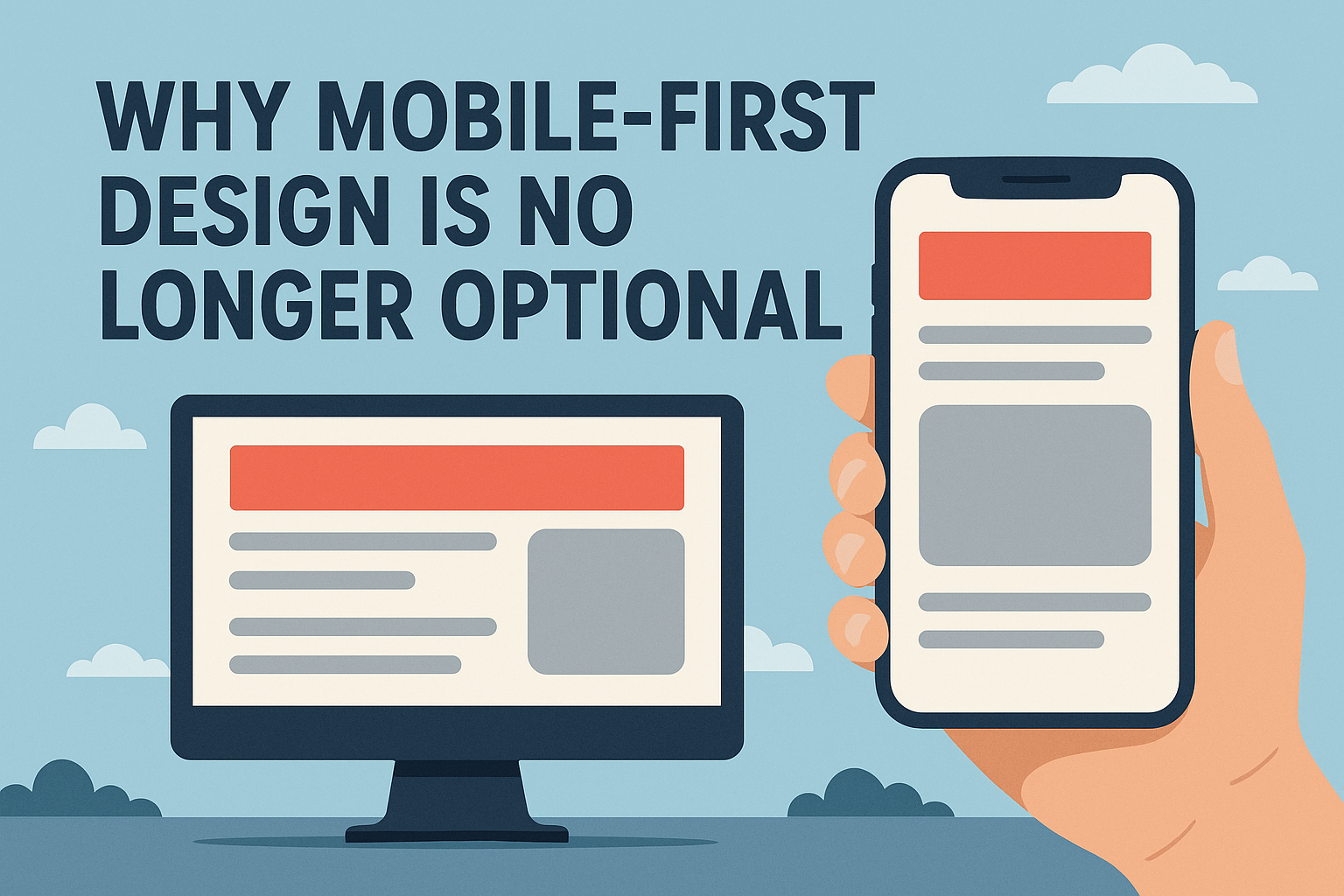
The mobile-first approach means designing websites for mobile users first and then expanding the experience for tablets and desktops.
Why Mobile-First Design Matters
- Improve User Experience
- Increase Google Rankings
- Reduce Bounce Rate
- Generate More Leads
- Improve Website Speed
- Build Customer Trust
1. Start with Mobile Layout First
Design the mobile version before desktop and focus on simple layouts, clear headings, easy navigation, fast loading, and clickable buttons.
2. Use Clean Navigation
- Hamburger Menu
- Clear Service Pages
- Click-to-Call Button
- WhatsApp Button
- Contact Form Link
Simple navigation improves user experience and conversions.
3. Optimize Website Speed
- Compress Images
- Use Modern Formats
- Remove Unnecessary Scripts
- Use Lightweight Design
- Choose Quality Hosting
Fast websites perform better on Google and keep visitors engaged.
4. Make Buttons Easy to Tap
Use large CTA buttons, proper spacing, and clear button text such as Call Now, WhatsApp Us, Get Quote, and Book Appointment.
5. Use Responsive Images
Images should automatically adjust according to screen size.
- Compress Images
- Add ALT Text
- Use WebP Format
- Avoid Oversized Banners
6. Keep Content Short and Clear
- Short Paragraphs
- Bullet Points
- Clear Headings
- Simple Language
Readable content keeps users engaged on smaller screens.
7. Test on Multiple Devices
Always test your website on Android phones, iPhones, tablets, laptops, and desktop screens to identify issues early.
8. Focus on User Experience
Ensure text is readable, buttons are clickable, menus work properly, pages load quickly, and forms are easy to complete.
Benefits of Mobile-First Responsive Design
- Better Google Rankings
- More Mobile Visitors
- Higher Lead Generation
- Faster Website Speed
- Better Customer Experience
- Lower Bounce Rate
- Stronger Online Presence
How Help Me Buddy IT Can Help
We help businesses with Responsive Website Design, Mobile-First Development, UI/UX Design, Website Speed Optimization, SEO-Friendly Development, WordPress Websites, Custom Development, and Landing Page Design.
Final Thoughts
A mobile-first website is essential for modern businesses. Customers expect fast, simple, and professional websites on their phones. Businesses that invest in responsive design can attract more visitors, improve trust, and generate more leads.
Comments
Share your thoughts about this post.